📚 Trusted by students, educators & researchers since 2017.

Nonlinear regression is a powerful statistical technique used when the relationship between your dependent and independent variables isn’t a straight line. While linear models assume a constant rate of change, nonlinear models allow you to map out accelerating growth, diminishing returns, and complex ceilings.
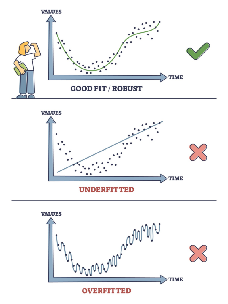
The “Helpful Stats” to Track
When you build a nonlinear model, you can’t just eyeball the curve to see if it’s “good.” You rely on performance statistics to validate your fit:
- $R^2$ (R-squared): This tells you the percentage of the variance in your data that the model explains. An $R^2$ of 0.95 means your model accounts for 95% of the data’s movement. You want this as close to 1.0 as possible.
- RMSE (Root Mean Square Error): This measures the average distance between your actual data points and the curve your model predicted. Since it’s measured in the same units as your dependent variable, lower is always better.
- p-values (Significance): When estimating parameters, a p-value under 0.05 generally indicates that a specific parameter is statistically significant and belongs in your model.
Use Cases & Examples
Nonlinear models are built around specific mathematical functions that match real-world phenomena.
1. Exponential Growth
- The Scenario: A startup’s user base doubling every month, or bacteria multiplying in a petri dish. Growth accelerates continuously.
- The Formula:$$y = a \cdot e^{bx}$$
2. Logistic (Sigmoidal) Curve
- The Scenario: Product adoption (like smartphones). Sales start slow, accelerate rapidly in the middle phase, and eventually level off flat as the market saturates.
- The Formula:$$y = \frac{L}{1 + e^{-k(x-x_0)}}$$
3. Polynomial Curves
- The Scenario: A car’s fuel efficiency based on its speed. Efficiency increases as you speed up to 55 mph, peaks, and then plummets due to wind resistance at 80 mph.
- The Formula:$$y = ax^2 + bx + c$$
Explore how different data distributions require different mathematical functions to find a good fit:
Nonlinear Regression Visualiser
R-Squared
0.000
RMSE
0.00
How to Build Nonlinear Models
Here is how you can implement these models in three popular analytical environments.
1. Microsoft Excel
For basic curves, Excel is surprisingly fast:
- Highlight your data and insert a Scatter Plot.
- Right-click any data point on the chart and select Add Trendline.
- Choose Exponential, Polynomial, or Logarithmic depending on your data's shape.
- Check Display Equation on chart and Display R-squared value on chart at the bottom of the pane.
For custom equations (like Logistic curves): You have to use the Solver add-in. You define columns for your Actual $Y$ and Predicted $Y$, calculate the Sum of Squared Errors (SSE), and tell Solver to change your parameter cells until the SSE is as close to zero as possible.
This video provides a detailed visual walkthrough of setting up and interpreting a nonlinear regression model directly in Microsoft Excel.
2. Python
Python handles complex modeling beautifully using the scipy.optimize library.
import numpy as np
import matplotlib.pyplot as plt
from scipy.optimize import curve_fit

# 1. Define your custom nonlinear function (e.g., Logistic)
def logistic(x, L, k, x0):
    return L / (1 + np.exp(-k * (x - x0)))

# 2. Generate some mock data
x_data = np.linspace(0, 10, 50)
y_data = logistic(x_data, 100, 1.5, 5) + np.random.normal(0, 5, 50)

# 3. Fit the curve to the data
# popt contains the optimized parameters for L, k, and x0
popt, pcov = curve_fit(logistic, x_data, y_data, p0=[max(y_data), 1, np.median(x_data)])

# 4. View results
print(f"Optimized Parameters: L={popt[0]:.2f}, k={popt[1]:.2f}, x0={popt[2]:.2f}")
plt.scatter(x_data, y_data, label='Actual Data')
plt.plot(x_data, logistic(x_data, *popt), color='red', label='Fitted Curve')
plt.legend()
plt.show()
3. R
R was built for statistics, so it has a dedicated function nls() (Nonlinear Least Squares) right out of the box.
# 1. Create your sample dataset
x <- c(1, 2, 3, 4, 5, 6)
y <- c(1.2, 3.5, 8.1, 19.5, 42.1, 88.5)
df <- data.frame(x, y)

# 2. Fit an exponential model
# Note: You must provide a "start" list as initial guesses for the algorithm
fit <- nls(y ~ a * exp(b * x), data = df, start = list(a = 1, b = 0.5))

# 3. View the regression stats, p-values, and parameter estimates
summary(fit)

# 4. Plot the results
plot(x, y, main="Exponential Fit", pch=16)
lines(x, predict(fit), col="blue", lwd=2)